Get Organized Today with Handbond!
Color Theory Basics: Choosing Colors for Your Coloring Book Pages with Handbond (Best Explanation 2024)
Introduction
Coloring is more than just filling in spaces; it’s an art form that allows for creative expression and therapeutic relaxation. Understanding color theory basics can elevate your coloring book experience by helping you choose colors that complement each other, convey the right mood, and create visually pleasing pages. At Handbond, we believe that anyone can become an artist with the right knowledge and tools. This guide will introduce you to the essentials of color theory and provide practical tips on choosing colors for your coloring book pages.
1. What is Color Theory?
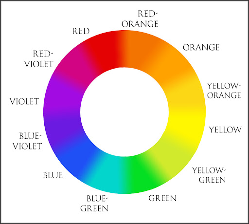
Color theory is a set of principles used to create harmonious color combinations. It’s based on the color wheel, which organizes colors in a way that shows the relationships between primary, secondary, and tertiary colors.
- Primary Colors: Red, blue, and yellow. These colors cannot be created by mixing other colors.
- Secondary Colors: Green, orange, and purple. These are created by mixing two primary colors.
- Tertiary Colors: Colors like red-orange, blue-green, and yellow-green, created by mixing a primary color with a secondary color.
Understanding the color wheel and how colors interact is essential for making intentional color choices that enhance the beauty of your coloring book pages.
2. The Basics of the Color Wheel
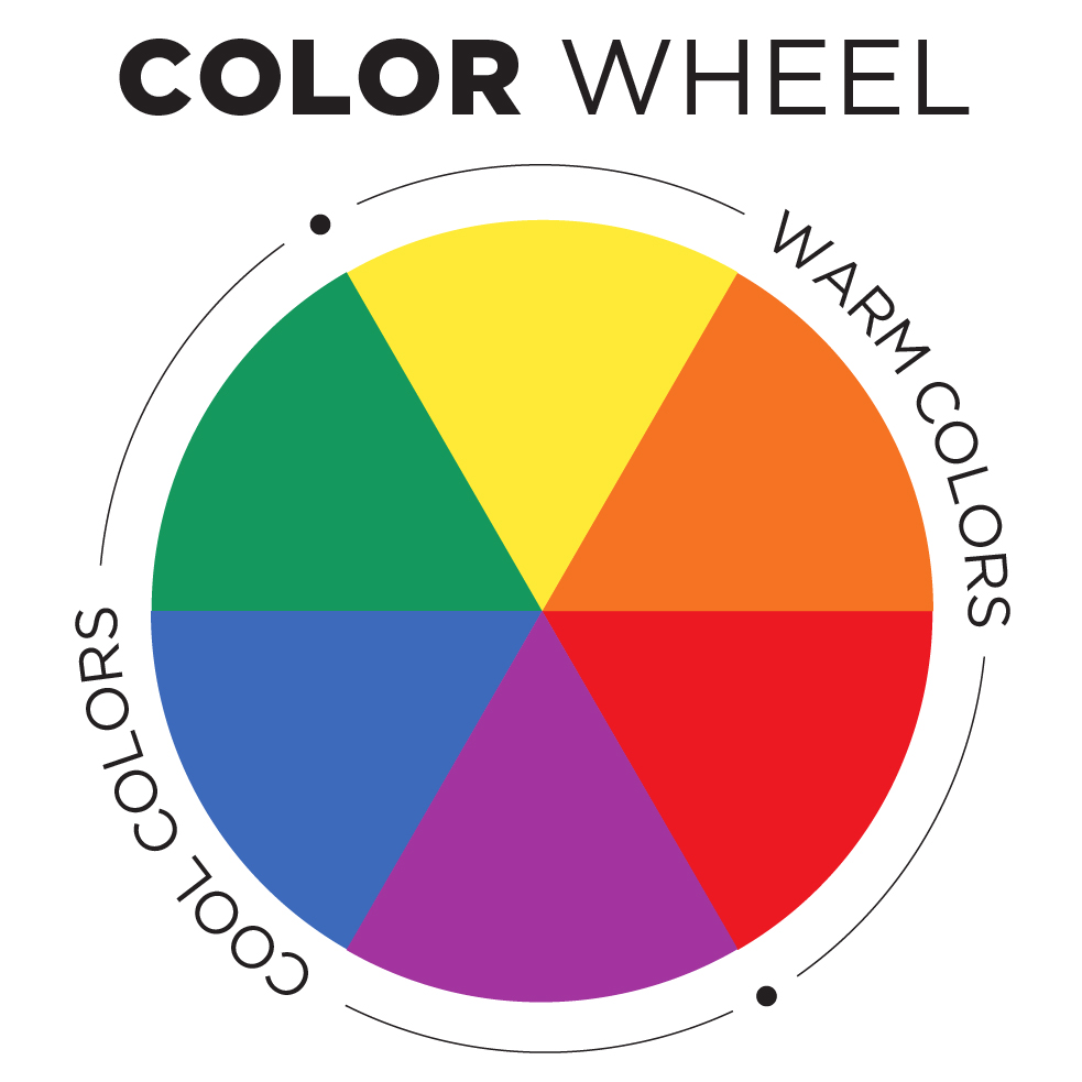
The color wheel is divided into warm and cool colors, which evoke different emotions and moods:
- Warm Colors: These include reds, oranges, and yellows. Warm colors are often associated with energy, warmth, and enthusiasm. They can make areas of your coloring page stand out.
- Cool Colors: These include blues, greens, and purples. Cool colors are calming and soothing, making them perfect for creating tranquil scenes in your coloring book.
By understanding the basics of the color wheel, you can start to make more intentional choices about the mood and feeling you want to convey in your coloring pages.
3. Understanding Color Harmony
Color harmony refers to the visually pleasing arrangement of colors. Choosing harmonious colors for your coloring book pages can make your artwork more engaging and enjoyable to look at. Here are some common color harmonies you can use:
- Complementary Colors: These are colors that are opposite each other on the color wheel, such as blue and orange or red and green. When used together, they create a high contrast and vibrant look. Complementary colors are great for making elements in your coloring pages pop.
- Analogous Colors: These are colors that are next to each other on the color wheel, such as blue, blue-green, and green. Analogous colors create a harmonious, soothing look that is perfect for nature-themed or calming coloring book pages.
- Triadic Colors: This color scheme uses three colors that are evenly spaced around the color wheel, like red, blue, and yellow. Triadic color schemes are vibrant and provide a balanced contrast that is ideal for creating dynamic and colorful designs.
- Monochromatic Colors: This scheme uses different shades, tints, and tones of a single color. It’s perfect for creating a cohesive and sophisticated look.
Handbond Tip: Experiment with different color harmonies in your coloring books to see how they change the mood and effect of your artwork. Try using complementary colors in our “Abstract Art for Relaxation“ coloring book to create striking, eye-catching designs.
4. Creating Mood with Color
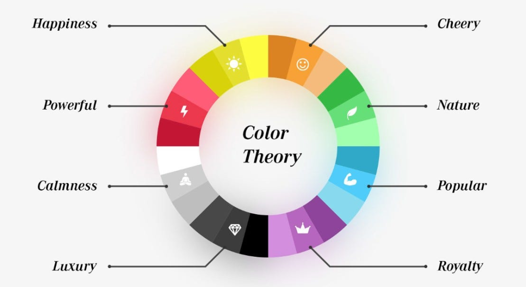
Colors have the power to evoke emotions and set the mood for your coloring book pages. By understanding the psychology of color, you can choose colors that align with the mood or story you want to convey.
- Red: Evokes feelings of passion, energy, and excitement. It’s a great choice for coloring pages that feature dynamic scenes or elements.
- Blue: Represents calm, trust, and serenity. Blue is ideal for coloring pages that depict peaceful scenes like oceans, skies, or serene landscapes.
- Green: Associated with nature, growth, and harmony. It works well in nature-themed coloring books and can create a refreshing and calming atmosphere.
- Yellow: Conveys happiness, optimism, and energy. Use yellow to add brightness and warmth to your coloring pages.
- Purple: Symbolizes creativity, luxury, and mystery. It’s a versatile color that can add depth and elegance to your designs.
- Black and White: Black adds drama and sophistication, while white represents purity and simplicity. Together, they can create high-contrast, modern designs.
Handbond Tip: Use colors intentionally to convey specific emotions. For example, in our “Nature-Inspired Designs Coloring Book,” try using green, blue, and soft browns to create a serene, nature-inspired page that evokes calmness and relaxation.
5. Tips for Choosing Colors for Your Coloring Book Pages
Here are some practical tips to help you make the most of color theory when choosing colors for your coloring book pages:
- Start with a Color Scheme: Before you start coloring, choose a color scheme based on the mood you want to convey. This will provide a sense of direction and help your final artwork look cohesive.
- Test Colors Before You Begin: Always test your colors on a separate piece of paper before applying them to your coloring page. This will give you a sense of how the colors look together and prevent any unwanted surprises.
- Use Light and Dark Values for Depth: Mixing light and dark shades can create depth and interest in your coloring pages. Don’t be afraid to use darker colors for shadows and lighter colors for highlights to make your pages more dynamic.
- Layer Colors for Richness: Layering different colors can add richness and complexity to your artwork. Start with a light base color and gradually add darker shades on top to build depth.
- Experiment with Different Mediums: Don’t limit yourself to just colored pencils. Try different coloring mediums such as markers, watercolors, or gel pens. Each medium offers unique textures and effects that can enhance your artwork.
Handbond Tip: Try layering techniques with our “Mandalas for Mindfulness“ coloring book. Start with a light base layer and gradually build depth by adding darker shades to create a more vibrant, three-dimensional look.
6. Practice Makes Perfect: Experiment and Have Fun!
The most important part of coloring is to have fun and enjoy the process. Don’t be afraid to experiment with different color combinations, mediums, and techniques. The more you practice, the more confident you’ll become in your color choices, and the more your skills will improve.
- Keep a Color Journal: Keep a notebook where you can experiment with different color combinations and write down which ones you like the most. This can serve as a handy reference guide for future coloring projects.
- Learn from Other Artists: Look at color combinations and techniques used by other artists for inspiration. This can give you new ideas and help you develop your unique style.
- Join a Coloring Community: Join online communities, such as Facebook groups or Instagram, where you can share your work, get feedback, and learn from other colorists. It’s a great way to stay motivated and inspired.
Handbond Tip: Use our “Handbond Creative Planner“ to keep track of your color experiments, favorite combinations, and any new techniques you want to try. It’s a great way to stay organized and inspired!
Conclusion
Understanding the basics of color theory can significantly enhance your coloring book experience, helping you create visually appealing and harmonious designs that capture attention and evoke the desired mood. Whether you’re looking to create vibrant, eye-catching pages or serene, calming scenes, the right color choices can make all the difference. At Handbond, we offer a variety of coloring books that cater to different styles and preferences, giving you the perfect canvas to explore and express your creativity.